Crap crap crap crap crap crap crap crap crap crap crap crap crap crap crap crap crap crap crap crap crap.
The crap in which I am speaking of is not poop (bad joke). Crap is an acronym in which describes the four basic principles of design. These principles are used not just within the world of advertising, but also within fashion and photography.
The acronym stands for:
- Contrast
- Repetition
- Alignment
- Proximity
Each principle can be used individually or together to form a piece of work that is not just visually appealing, but effective as well. The following images will each exemplify the CRAP principles.
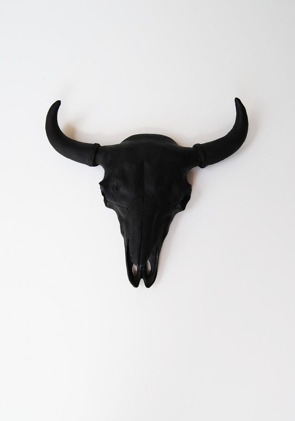
This image actively uses the principle of contrast. What I mostly use contrast for is to isolate a certain piece of an image. Within this photograph the eye is immediately drawn towards the skull for its deep black colour. Say that this skull was placed upon a black background, the item would not only blend in to the background, but would lose its vibrance. By placing an item deep in colour on a plain background, the object is immediately highlighted.
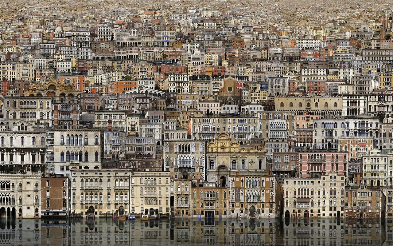
The next image exemplifies the concept of repetition. I must admit, this image is a tad scary for the repetition of these houses can be intimidating. Repetition is used to state a point by repeating a certain image, word, or phrase. Think of the Simpsons when you think of repetition. When Bart is in detention re writing out the same phrases, this is for the purpose of ingraining the concept into his mind. By using repetition in an image, the purpose is to highlight a certain part of the image and create a statement.
The next image exemplifies the principle of alignment. Alignment is used to create symmetry within an image. Alignment is naturally appealing to the public for true symmetry is considered beautiful. The image of the pencil crayons shows a concept called centre alignment. Centre alignment is usually considered dull for it takes the brain longer to process. With the pencils in perfect alignment, the image makes a statement. This image combines the concepts of contrast and repetition as well for the white background makes the bold colours appear vibrant.

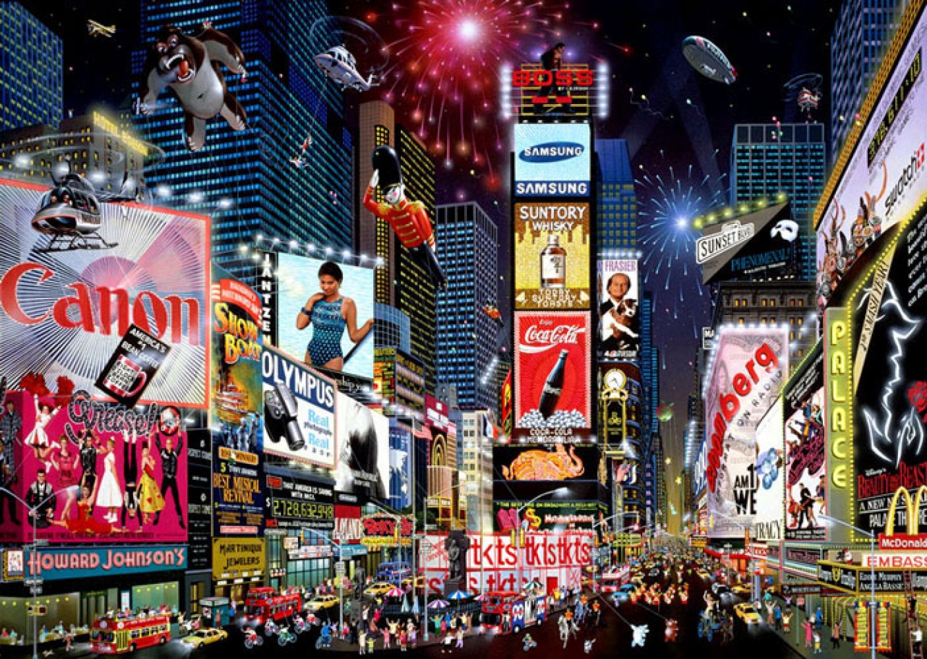
The final image exemplifies the principle of proximity. The irony of this photo is the fact that THERE IS NO SPACING IN TIMES SQUARE. Proximity regards the placement of the items in an image. Times square lacks the concept of proximity due to everything being so damn close together. Proximity is used to create a point using isolation. Think of proximity using this analogy: On a crowded subway, you feel uncomfortable when you have 30 people with their noses pressed up to your neck. The same is said with images, when items are too close together it forms an un-unified tension in which can be seen as unappealing.
Related articles
- Whatchu say about CRAP? (Week 6) (sarahlevinsky.wordpress.com)
- Week 6: CRAP (christopherbjola.wordpress.com)
- Ah, CRAP! (rayablack.wordpress.com)
- To put it simply: C.R.A.P. (skranyak.wordpress.com)
- Week 4: CRAP, eh (levennamyers.wordpress.com)
- Week 6- Crap (theresak19.wordpress.com)
- Crap! (seannysins.wordpress.com)
- Week 6: CRAP (anisahdass.wordpress.com)
- Week 6 – The CRAP Principles (mbrombal.wordpress.com)
